Art by George Butler.
This episode was written & produced by Doug Fraser and Casey Emmerling.
Today, virtually every streaming platform has a sonic logo, from HBO’s classic “Static Angel” to the iconic Netflix “Tudum.” For Hulu, standing out in such a crowded marketplace has been a process of experimentation and revision. In this episode, we chart the evolution of Hulu’s sonic branding across 5 unique sonic logos. Along the way, the creative team shares unused alternate versions for the first time, and breaks down how they used AI to test their latest sound. Featuring Dan Capstick of DixonBaxi, Matthew Wilcock of Zelig Sound, and Reid Thompson of Hulu.
MUSIC FEATURED IN THIS EPISODE
Featuring original music by Wesley Slover
Stay by Redlands
The Mountain by Sound of Picture
Kygoje by Sound of Picture
Baby’s Room by Brandon Moeller
Fabric by ZI
Metropolis by Sound of Picture
no doubt by Ezzy
Lines (with Farves & Catching Shapes by Arkangel
Challenges Ahead by From Now On
Ripples by ZI
You See a Wall, I See a Window by UTAH
Twenty Thousand Hertz is produced by Defacto Sound.
Subscribe on YouTube to see our video series.
If you know what this week's mystery sound is, tell us at mystery.20k.org.
Support the show and get ad-free episodes at 20k.org/plus.
Follow Dallas on Instagram, TikTok, Facebook, and LinkedIn.
Join our community on Reddit.
Find the right candidates with a seventy five dollar sponsored job credit at indeed.com/hertz.
Try America's #1 ready-to-eat meal kit with fifty percent off using promo code TTH50 at factormeals.com/tth50.
Find the right doctor, right now with at zocdoc.com/20k.
Learn a new language with fifty five percent off at babbel.com/20k.
View Transcript ▶︎
You’re listening to Twenty Thousand Hertz.
[music in]
One of my absolute favorite sonic brands is Hulu. For listeners outside the US, Hulu is a streaming service that launched in 2008. Over the years, they’ve used a lot of different sonic logos, many of which I’ve really loved. But if I had to pick a favorite, I’d probably go with the latest version.
[music stop for Hulu current logo]
[music resumes]
To me, that sonic logo is a perfect little story, with a buildup, a crescendo, and a release, all told in just a few seconds. When I hear it, I almost get a physical reaction.
[music stop into Hulu current logo + OMITB theme]
My dopamine fires…
And I’m ready to dive into whatever comes next.
[music in]
Now, sonic logos go by a few different names. Some people just call them sonics.
Dan Capstick: Quite often we call it a mnemonic.
That’s Dan Capstick.
Dan Capstick: I am head of creative at DixonBaxi, a branding agency based in London, UK.
DixonBaxi has worked with everyone from IMAX to Samsung to Hulu. They help these companies design a more memorable and relevant brand... And that includes their sonic brand.
Dan Capstick: A sonic logo, by its makeup, is often a very short piece of media, three or four seconds long at max, and you have a very limited time to play with to communicate what that brand stands for.
[clip: montage of 3 sonic logos]
Dan Capstick: So it's possibly one of the hardest working pieces of music or sonic that there could possibly be in branding.
Matthew Wilcock: Yeah from my experience, like less is more.
[music in]
Matthew Wilcock: My name’s Matthew Wilcock. I co-own and I'm the Creative Director at Zelig Sound, an original music and sound company.
Zelig has done sonic branding for companies like Hulu, Nike, and Amazon Prime Video. And they frequently work with Dan's team at DixonBaxi.
Matthew Wilcock: When you’re composing a piece of music, you're trying to get to the very root of the idea or the emotion.
And that starts with the brand itself.
Matthew Wilcock: We're kind of led by what they tell us they want the brand to be, and then we have to take that and translate that into an emotion.
For instance, Amazon wanted the sonic logo for Prime Video to be vibrant and celebratory, with a dash of entertainment. They wanted to balance something small-scale and human, with something epic and cinematic. With all of that in mind, here’s the Prime Video sound that Matthew's team designed.
[music out]
[clip: Amazon Prime logo]
You can think of sonic logos kinda like the next evolution of the old-fashioned jingle.
[clip: Rice-A-Roni Jingle]
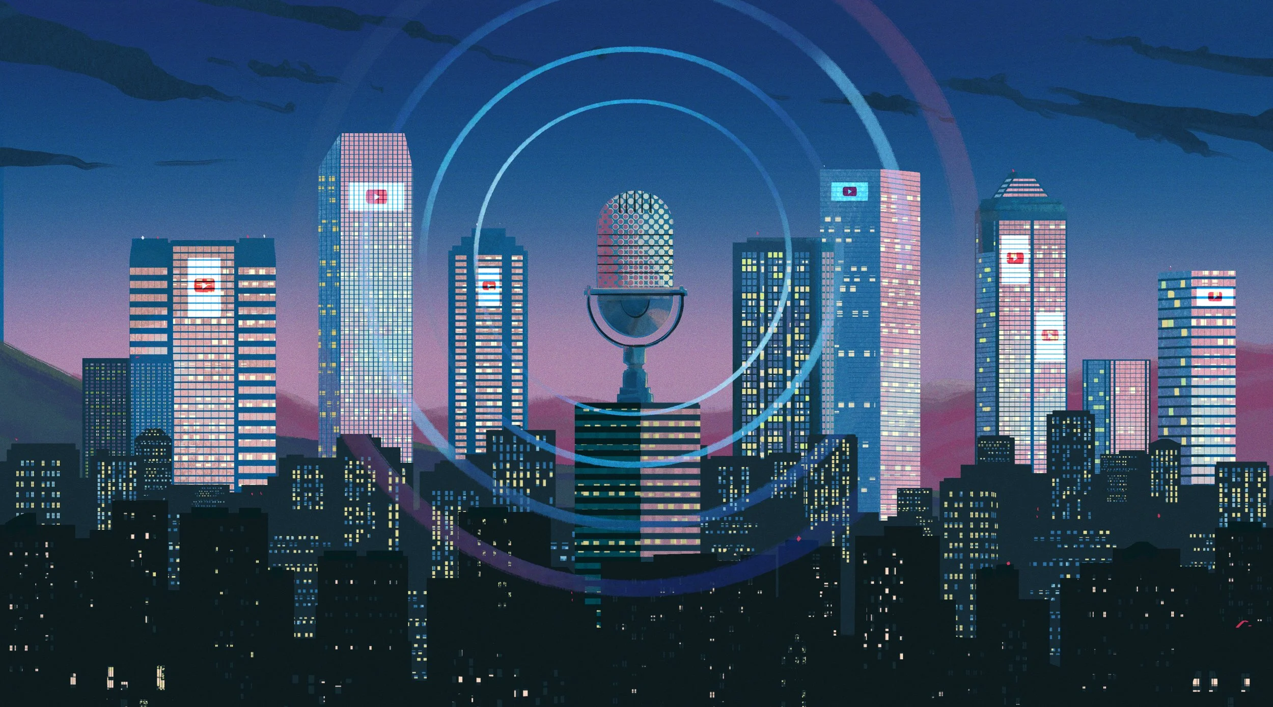
Nowadays, the jingle isn’t nearly as common as it used to be. Instead, its younger cooler sibling – the sonic logo – has taken the spotlight.
Dan Capstick: The sonic logos have really rocketed in use over the last decade or so, as streaming platforms have really taken ahold and changed the way people view TV and film and content on their tellies.
Today, almost every streaming service has a sonic logo, from the huge ones like Apple TV Plus...
[clip: Apple TV+ logo]
...To the niche ones like the horror platform, Shudder.
[Shudder logo]
Matthew Wilcock: What's super interesting to me about these entertainment sonics, unlike any other sonic, is that when you click on the service, you have to listen to this.
For a lot of branded sounds, you really only hear them in commercials.
[I'm Lovin’ It]
Matthew Wilcock: You don't have to hear them if you're ordering McDonald's or going into the store.
On the other hand...
Matthew Wilcock: Netflix is so popular a sonic brand because there is no way, 99% of the time, to interact with that product without hearing it.
[clip: Netflix logo]
But since users hear these sounds so often, if you're not careful, they can easily become annoying.
Matthew Wilcock: If you want to do the most memorable thing possible for your brand, you literally scream the brand name in the most simple melody possible. But that's not going to sound like your brand at all.
[Netflix - bad metal version]
Matthew Wilcock: So, it's not going to feel like your personality, like whatsoever.
[music in]
With so many factors to consider, it's easy to see how a new streaming platform might go through several sonic logos before they find one they wanna stick with.
For Hulu, it all started in 2008, back when the company first launched. Now, this was well before streaming became synonymous with sonic logos. Disney Plus, HBO Go, Apple TV Plus, and Prime Video were all still years away. Netflix had only started streaming the year before, and wouldn't launch their iconic Tudum sound for another seven years. So in many ways, Hulu blazed the trail with their original sonic logo, which sounded like this.
[music out into Hulu first logo]
Reid Thompson: I feel like that sound really connects to kind of the baby Hulu, if you will.
[music in]
Reid Thompson: I’m Reid Thompson and I head up the brand creative team here at Hulu.
Reid says the goal of that first sound was to be bright and cheerful.
Reid Thompson: It was kind of the spirit of the friendliness and the more casual side of the brand.
But while it does sound nice, it's also a bit generic. It could work just as well for a food delivery app, a kids clothing brand, or an insurance company.
[music under into Hulu first logo]
So in 2011, Hulu decided to make a new sonic logo. This time, they wanted to take inspiration from the word Hulu itself.
Reid Thompson: It's just a name that's fun to say and feels good.
But the meaning of Hulu goes much deeper than that.
Reid Thompson: It's a Mandarin word for “a holder of precious things.”
…which was a perfect fit for the company's mission.
Reid Thompson: Everybody has a mix of content that they love, and I feel like that's kind of at the core of the spirit of Hulu, finding the things that you love.
So Hulu created a second logo with four notes, one for each letter in their name.
[Hulu logo - Sunset]
Reid Thompson: You can hear, still the warmth and the human quality of it but also there's much more polish.
In the on-screen animation, the words Hulu Originals appear in front of a wall that's lit by a sunset.
[Hulu logo - Sunset]
There was also a slightly different version with a sunrise. In that one, the first two notes are a little faster and airier.
[Hulu - Sunrise]
Both versions were meant to capture the calm and wonder of these magical hours, sunrise and sunset. But they still didn't quite feel powerful enough.
Reid Thompson: While everybody this was a very pleasant sound, it wasn't necessarily differentiating.
Ontop of that, Hulu wanted their next logo to match their new premier content.
Reid Thompson: It came out around the time as The Handmaid's Tale launched, which was another sort of defining moment on the content side for the brand.
[clip: Handmaid's Tale Emmy]
Reid Thompson: We really wanted to be more cinematic. And we really wanted to establish this evolution of Hulu.
In the end, they landed on this.
[Hulu Logo Cinematic]
Reid Thompson: This was inspired by the Sunset.
[Hulu logo - Sunset]
Reid Thompson: ...but really a much tighter sound.
[Hulu logo - Cinematic]
Now, all of the logos we've heard so far were designed for Hulu Originals. In other words, you open the app, click on a Hulu Original, and then you hear the sound. But in 2017, Hulu added a dedicated sound for opening the app itself. It featured a reversed, washy chord that swells into a melodic resolve.
[Hulu App Open]
This sound launched in tandem with a big redesign for the app that went under the codename Bowie. It involved color gradients that dynamically changed based on the show or movie you were looking at.
Reid Thompson: And so you can hear some of that gradient light sound in that sonic piece.
[Hulu App Open]
[music in]
By that point, Hulu was just seven years old, but they'd already gone through four completely different sonic logos. And they still hadn't made the sound we hear today. To get to that, the creative team would have to answer all kinds of challenges.
Dan Capstick: Is the sound easy to remember? Can you sing it back? Does it have energy?
They'd face some tough criticism.
Reid Thompson: "That sound and that big green flash at the beginning of everything really drives me crazy."
And they'd even need help from the robots.
Dan Capstick: This is the first time that I've been involved with using AI in the creation of a sonic identity.
That’s all coming up, after the break.
[music out]
MIDROLL
[Hulu logo montage in]
By the late twenty tens, Hulu had become one of the most popular streaming platforms in the US. And as the company evolved, so did their sonic logo.
[logo montage out]
But around 2020, Hulu embarked on another big, company-wide rebrand.
[music in]
Reid Thompson: This was all connected to a project we worked on with DixonBaxi called “One Hulu.” We really wanted to create more of a cohesive, "Hulistic,” as I called it, ecosystem.
Part of this rebrand involved a new sonic logo. So Reid teamed up with Zelig and DixonBaxi, to craft a sound that could stand out among all the other streaming logos that had flooded the market.
[music pause for Disney+, AMC+, Peacock logos]
[music resumes]
At the time, Hulu's research showed that their existing logo just couldn't compete with their main competitors.
Reid Thompson: One of the things that had been identified was that, that sound that we currently have is usually at the bottom of the list in terms of distinctiveness, with HBO and Netflix up there at the top.
[music out into Netflix Tudum]
To start out, they took a close look at some of these other sonic logos to understand what works about them. For instance, they analyzed HBO's classic Static Angel sound…
[HBO Static Angel]
Dan Capstick: One of the things that works there is the kind of contrast in the sounds: the woosh of static, that noise at the start.
[Static Angel Static]
Dan Capstick: And that's contrasted with the beautiful synthy choral chord.
[Static Angel Chord]
Dan Capstick: And they're two sounds which don't really live together normally, but then you create these two opposing sounds that make some kind of magic together.
Another thing these logos had going for them was flexibility.
Dan Capstick: You've got to consider what that sound is gonna be rubbing up against. It can't sound out of place in front of anything. It's gotta sound like it elevates everything that follows.
For example, the Netflix Tudum sounds great going into the Stranger Things theme song…
[Tudum into Stranger Things theme]
But it also works just as well before the theme for a comedy like Bojack Horseman.
[Tudum into Bojack Horseman]
After the team had assessed these other companies, they talked about what makes Hulu unique.
[music in]
Reid Thompson: You know, among the streamers we've always said it's sort of the most human brand. there's a lot of red carpet brands, brands associated with older entertainment ideas, box offices and flicks. Whereas Hulu is, since it was born of the aughts, and the era of YouTube, and even our name is a fun human lowercase name. So the Hulu brand has always been about that kind of human connection to storytelling, and the fun and love of television.
With this in mind, they took a close look at all of Hulu's previous branding.
Dan Capstick: Everything from digital advertising, out-of-home billboards, the platform itself, the user interface design, and of course the sonic brand itself. And all those things needed really to be brought back into a cohesive message or image.
[music out]
Finally, it was time to actually create some new sonic logos. The sounds they created fell into three broad categories. First up were the melodic versions. Here’s a handful of those:
[melodic versions]
Like the earlier Hulu logos, some of them had four distinct notes.
[melodic - 4 note versions]
The next category was less musical. Instead, these were built around punchy, dramatic sound design.
[sound design versions]
Finally, they did a series of vocal versions using the word Hulu.
[Hulu Alt spoken]
Matt felt like this approach could be a great way to stand out among the other streamers.
Matthew Wilcock: None of them have vocals. Like none of them say their brand name. So I was like, “If we could get someone to say their brand name, in like an interesting way…” And that’s what we tried to do.
[Hulu Alts Sung 1 + 2]
This strategy has worked for plenty of other companies...
[Sega + Yahoo]
But in the end, they decided that hearing the name over and over would get too repetitive.
Reid Thompson: We think it's a fun word to say, obviously, but we felt like that was going just a little too far.
After months of work, and dozens of variations, they landed on this.
[Hulu Current Logo]
Matthew Wilcock: That intro part with the portal…
[Hulu 4 Parts - Section 1]
Matthew Wilcock: We wanted it to feel like you were almost in an auditorium, or in a theater. Like something is bubbling under the surface and about to start.
[Hulu 4 Parts - Section 1]
Dan Capstick: You hear that at the beginning, there's a glimmer of light, then there's a snap of energy.
[Hulu 4 Parts - Section 2]
Dan Capstick: The four letters of Hulu are represented with a really beautiful, almost xylophone wood block kind of finger snap moment. Happens in really quick succession.
[Hulu 4 Parts - Section 2]
Dan Capstick: Then you have this beautiful, nostalgic kind of chime…
[Hulu 4 Parts - Section 3]
Dan Capstick: It bursts forth with this energy. And then that kind of sweeps past you, as a visual, and the kind of sonic washes over you.
[Hulu 4 Parts - Section 4]
Matthew Wilcock: The ending feels quite open. Like we don't resolve. It just goes off into the ether. That's an opening into something.
[Hulu 4 Parts - Section 4]
Reid Thompson: And then you push yourself into the Huluverse.
[Hulu Current Logo]
[music in]
Matthew and Dan were confident that they had captured the essence of the brand. And when they brought it to the Hulu team…
Dan Capstick: They responded really positively to it. They loved this idea that there was this representation of broad, diverse, exciting content. And then they loved that contrast with it snapping into the center and forming the logo itself. And then they really enjoyed the way it felt like you were transported and pulled in towards Hulu at the end.
That journey is reflected in the sound’s nickname.
Reid Thompson: The theme name at the time was "Take Me There.”
The name Take Me There came from the idea that this sonic logo was a gateway to entertainment. Once it played, you were transported into the story. And just like they had hoped, it sounded great when it came before one of their dramas, like The Handmaid's Tale...
[music under into Hulu logo + Handmaid’s Tale theme]
And it worked equally well before comedies like How I Met Your Father.
[Hulu logo + HIMYF theme]
In the past, that would have been the end of the process. But this time, Hulu wanted to try something new.
[music in]
Dan Capstick: This is the first time that I've been involved with using AI in the creation of a sonic identity. So we didn't use AI to guide our decision making, but we did use it to test our final results.
They fed their new sonic logo into an AI program from a company called Veritonic, which tested it across multiple categories.
Dan Capstick: So the AI uses certain metrics, certain aspects of sound design, emotional states and things like that to create a logo score. Things like recall. Is the sound easy to remember? Can you sing it back? It obviously knows how to figure that one out. Authenticity. Is it original? Does it have energy? Does it sound familiar? Is it happy or sad? Does it seem powerful and confident? Is it relaxed or is it unique?
[sound of machine working, bleeps and bloops]
The algorithm takes in all of these factors, and gives the sound an overall score between zero and a hundred.
[music out into bing]
The team ran a bunch of different sonic logos through the AI, including Apple TV+...
[Apple TV+]
…As well as Intel.
[Intel]
Dan Capstick: And it just allowed us to sort of build some evidence around the process, and allowed us to see where those big sonic brands live, how they perform, and then we could look at what we created and see how that stacked up against it.
Dan Capstick: You know, something like HBO scores a 56. [HBO Static Angel]
They also tested their last Hulu Originals logo.
[Hulu - Cinematic]
Dan Capstick: The previous Hulu sonic identity was scoring in at 44, which was obviously in need of massive improvement.
And then came the moment of truth:
[drum roll]
…running their new logo through the algorithm.
[repeat computer generating score]
Dan Capstick: The new Hulu sonic identity came in at [bing] 65.
That’s nine points higher than HBO's Static Angel.
[celebration sounds]
Dan Capstick: I couldn't believe it. It’s like, “Yes! Now I've got the proof! ”
[music in]
The Hulu team loved it. The AI scored it high. But you can’t please everyone. And by everyone, I mean Reid’s cousin. After the logo went live…
Reid Thompson: She was like, “Oh I love Hulu, but that sound and big green flash at the beginning of everything really drives me crazy. You don't do that, do you?” And I said, “Well, actually yes, that is exactly what I do.” But at least I felt like, “Oh, at least she noticed it.”
If you think about it, a reaction like that isn’t too surprising. Because, for most people, a sonic logo isn’t something you’re gonna love instantly. Instead, it grows on you because of the experiences you have around it. In this case, it’s the shows and movies that you come to associate with the sound. It’s a long and very subjective process. And that subjectivity is why Dan prefers not to work with focus groups.
Dan Capstick: When it comes to sonic branding, it really can suffer from subjectivity. So it's best avoided, in my opinion, really. Things shouldn't be tested that way.
With projects like this, it can be easy to get too many cooks in the kitchen.
Dan Capstick: With a sonic identity, you have to do it strategically. You have to do what you feel is good. You know, you’re the creative agency, you’re the creative director, so you have to have a vision for what you want to bring into the world.
[music in]
Creating a great sonic logo is a really challenging process.
Matthew Wilcock: You have those big highs where you like, you're on the third sign off meeting with the Executive Creative Director, and it goes amazing, but then there's a bit of feedback that then you drop down and you think, “Oh, now I have to like, re-up again to do a whole big batch of testing to get it to some other place.”
Matthew Wilcock: So every point is like, you get to this point of elation and you're like, “Oh, now I have to do it,” and then you get to another point and you're like, “Oh, like now I have to deliver it.” And then it's like, “Oh now it has to test well.” There's always these kind of interesting moments throughout the journey.
It also takes commitment and continued strategy from the brand.
Dan Capstick: Part of the power of sonic branding is using that branding consistently and correctly in the right places and not hitting people over the head with it constantly, so being respectful about when and where you use it.
But when a sonic brand really works, it can stick with people for decades.
Reid Thompson: The best sonic logos really think about the viewer and their state of mind at that time, either opening an app or going into a piece of content. Especially as everyone's sitting down, excited to get in there, you have this great opportunity to really set an intention, a connection to the brand. So it's an incredibly powerful tool, that sound, and we're not taking lightly the value of that moment.
[music in]
Twenty Thousand Hertz is produced out of the sound design studios of Defacto Sound. Find out more at Defacto Sound dot com.
This episode was written by Doug Fraser. It was story edited by Casey Emmerling and Andrew Anderson. It was sound designed and mixed by Joel Boyter, with original music by Wesley Slover.
Thanks to our guests, Reid Thompson, Dan Capstick, and Matthew Wilcock. To see more of their work, just follow the links in the show notes. And you can follow me over on LinkedIn. That’s where I post my own personal thoughts about things like sound design and sonic branding.
I'm Dallas Taylor. Thanks for listening.
[music out]